Name Board for Tasha
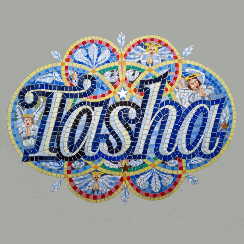
A3 Illustration for a wonderful person called Natasha, Tasha to all who know and love her. her.
Helen of Troy illustration
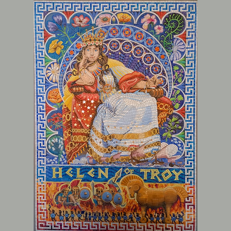
The most beautiful woman in the world according to Greek myth, the result of the king of the gods Zeus and a brief liaison with Leda (she turned herself into a swan to avoid him – as you do). Her elopement and seeming kidnap caused the Trojan war and its destruction. A2 in size, hand […]
European Medical Writers’ new writing guide
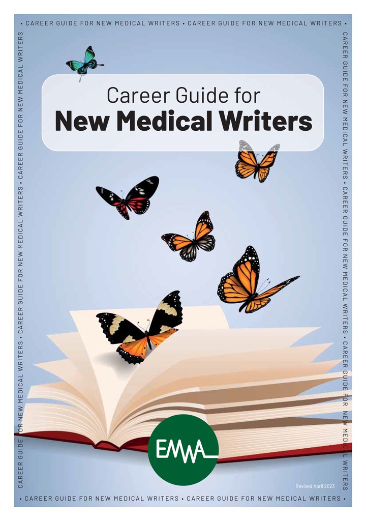
The European Medical Writers Association (EMWA) has been a trade association for all medical writers, both within Europe and beyond for nearly 30 years. They have just updated their guide to medical writing for both print and internet download. Comprehensively updated, enhanced, enlarged and improved. Designed by us from inception through to printing. 24 pages […]
YMCA new Annual Review
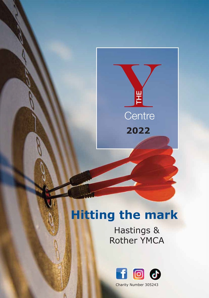
The Hastings and Rother YMCA, the ‘Y Centre’, has been hosting and accommodating sports activities since 1968. We have designed a new booklet highlighting its activities since it received the [late] Queen’s Award for Volunteering. A joint Annual Review, fund raising overview and publicity guide. Designed from inception through to printing. 12 pages A4, full […]
Willow and Jack
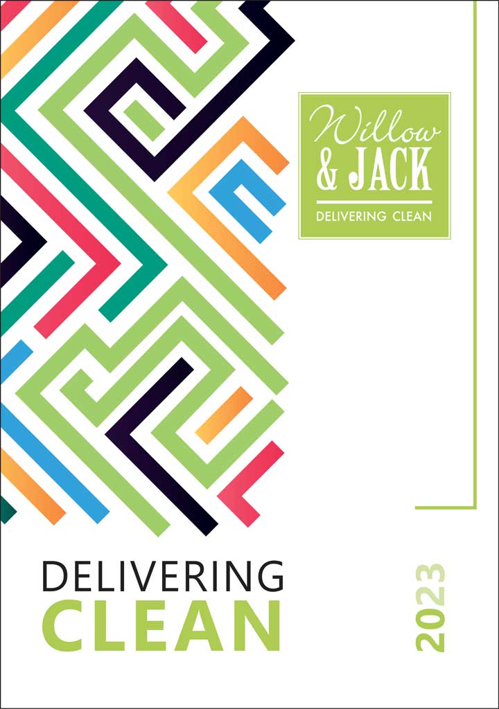
Willow and Jack is a new company (established 2022) selling cleaning products, especially dispensers for hands: their supply and the specialist cleansers that they use; foam, gel and soap. We designed a new brochure for them listing the products, their properties and how they work. The imagery highlights the founder’s South African heritage. Supplied as […]
Raaft decking
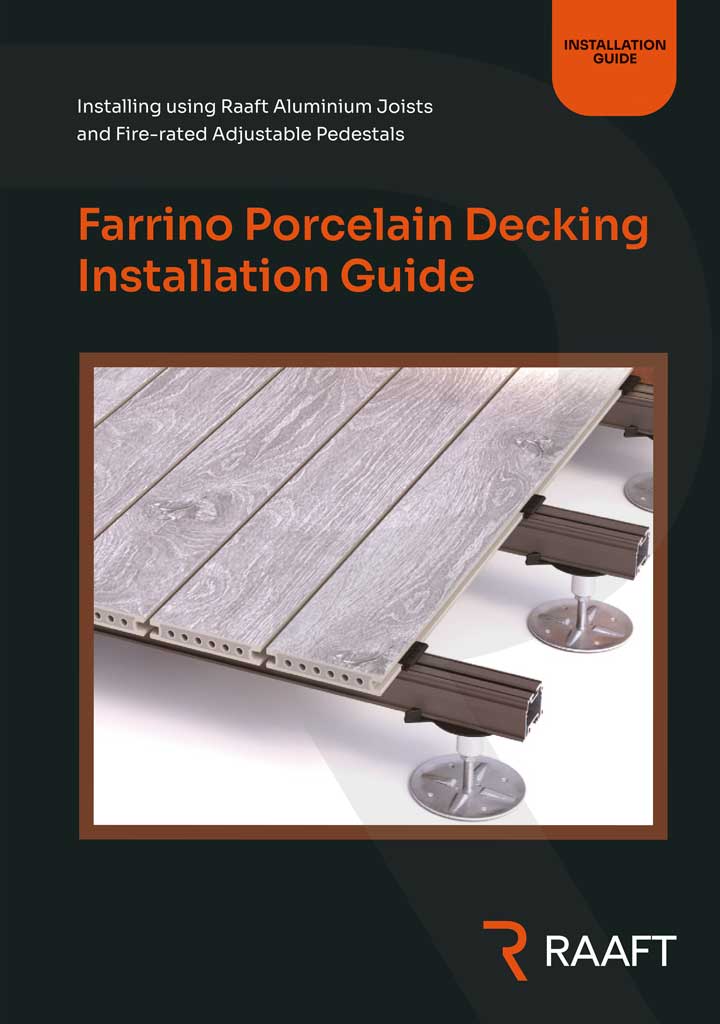
Raaft is Sussex based manufacturing company which designs, produces and retails decking solutions for [mainly] business customers. We have produced a range of brochures and data sheets for them covering different aspects – their preparation, assembly, different permutations etc. About a dozen in total. Not printed, purely pdf downloads from their website and to be […]
Somm records
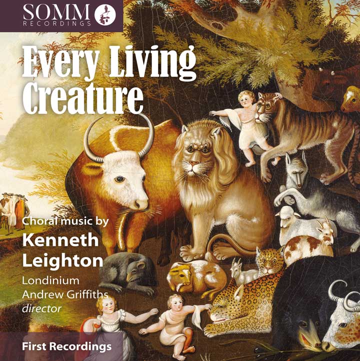
Somm records is a highly regarded independent CD producer: recording, distributing and publicising classical music to a hugely appreciative market. Typically two releases a month using established and very reputable singers and orchestras for well and less know composers – across many centuries, for mainstream and less, so both breadth and depth. The latest two […]
A new redesign for the Wheelwrights

The City livery company, The Honourably Company of Wheelwrights has been in existance for centuries. Because of covid they have not felt the need for an annual review as frankly they haven’t really done that much – certainly not worth mentioning (except of course their not insignificant charitable giving). We recently undertook to redesign this […]
Insufix logo

A new logo for the Rapid Ramp company, insufix is a range of fixings for the clamps that hold their ramps together. Mark, their boss professes himself ‘well pleased’.
A redesign for the Fruiterers
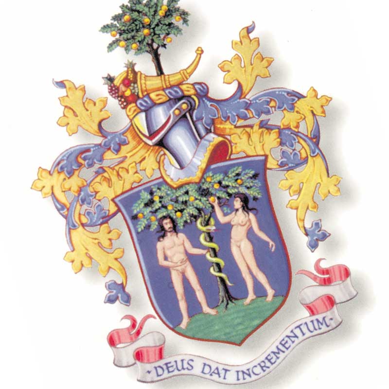
The City livery company, The Honourably Company of Fruiterers has been in existance for centuries. We have been designing their quarterly newsletter for a fraction of that time but still a few years now. We recently undertook to redsign this with a new look, it is now redesigned to look more contemporary: cleaner, easier to […]
